Improve your Photography and Videos with Set Design
Over 10 years into taking photos, it’s safe to say I’ve been bored of my own pictures lately, and have been increasingly open-minded in looking for new ways to keep my work innovative. Delving deeper into creative concepts, the best way I feel I’ve improved as a photographer is by exploring set design and focusing my efforts on the pre-production.
Portraits are my thing. For me, aesthetically, nothing is more interesting than a close-up portrait. Except it’s easy to feel unfilled as a portrait photographer, with the constant paranoia that you’re relying too heavily on a pretty model to carry you through and not extorting your photographic talent to its full potential. Although close-ups are still important to me and something I’ll always shoot, it’s important to move away from your comfort zone and prove, mostly to yourself, that your creativity runs deeper.
I’ve always found that having an underlying concept really helps a shoot to develop. It depends on personal taste, of course, but I like to keep the ideas behind the shoot subtle and use them as a means of inspiration and a way to help the shoot flowing, rather than presenting them too literally in a shot. In this recent shoot with pop singer Bebe Rexha, taken for the cover of Euphoria Magazine, I decided to implement my own experiences with anxiety. I won’t bore you with the details, but what I will say is that everything in this project has, naturally, been exaggerated for artistic effect. I based the idea on my feelings of social anxiety, and it evolved into a concept that centered around good versus evil. Translating it into a visual idea, I decided to go with a black and white theme, creating various set-ups that presented a clash of the two colors.
Set design doesn’t have to be expensive, either. The main set you see here was created entirely from cardboard and chalk. First, we collected and tore apart boxes, before painting them black and taping them together. We then smeared chalk around the edges to contrast with the black and rough it up a little. The final touch was to add bolder lines with a chalk pen. The finished product – including Rexha’s expression – reflects how busy the mind can get with paranoid thoughts.

For the next setup, I wanted a design that would reflect the effect of fame on a person’s mind. Frequently working with musicians who find themselves in the spotlight, I’ve had some insight into their world. I see the way in which people forget that they too are human. People think that being rich means you’re unaffected by the words of others, and so the media continue to provide the public with platforms on which to degrade them. I had read that Rexha herself has suffered anxiety in the past, which became the foundation for the shot you see here. This one was cheap to execute too, created for the most part by using a bunch of free newspapers. These were layered and pinned to a polyboard, before extra bits of ripped paper were added sporadically to roughen up the set somewhat. We used spray glue to tighten everything up and make sure it stayed in place. I really like the end result: it’s a straightforward image in that it still has a studio-esque feel with fashion elements present, but the set design gives it an edge in comparison to if we had we just shot it against a plain white colorama.

Aiming to keep the set design costs as low as humanly possible – and also cater to the limited timeframe in which we had to shoot this – we at this point simply flipped the colorama around for the next look. During prep time, we had laid out our next set. In creating the moodboard for this shoot, I knew I wanted to do something that involved lines or patterns stretching from different angles. Initially, I had wanted to use white string against a black background, but given the time constraints, my set designer and I settled on using thick masking tape against the polyboard. We used black tape on the white polyboard and vice versa to create that contrast. It didn’t take long to set up, and we even reused this set. It doubled up as the backdrop in the broken mirror shot, also below.

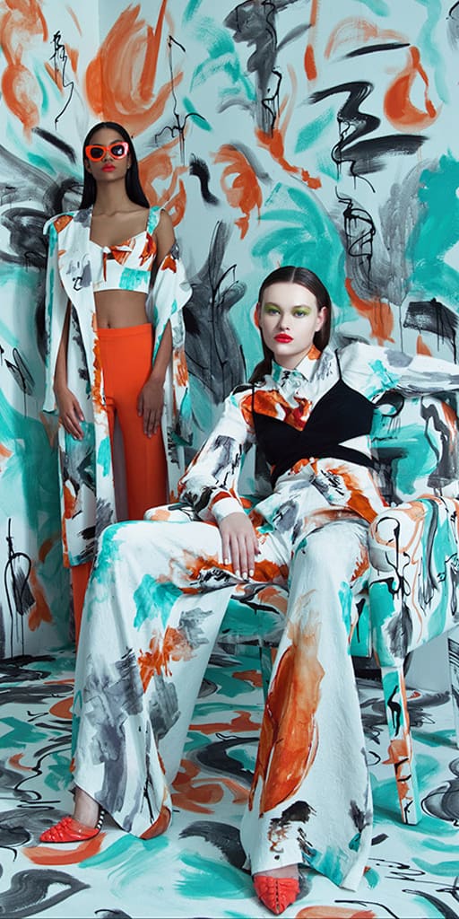
The final setup consisted of a stained industrial sheet. The most fashion editorial shot of the bunch, these sheets can either be purchased from retailers or painted/dyed yourself. The texture of the sheet just makes for a more interesting portrait in comparison to shooting against a plain colorama.

There are a number of reasons I love implementing set design in my shoots. The first is the creativity. It’s a really fun process to see something come to life, to have your vision advancing from just an idea in your head, to a moodboard, to assembling the materials and everything needed, constructing it, and seeing the finished product in a photo.
Through set design, I’ve found other ways to be creative or simply unwind. Painting is something that’s always felt therapeutic to me. Putting on scruffy clothes and getting lost in painting, whether that be on a canvas backdrop or a bunch of cardboard, is a great way to disconnect from the world (social media) for a few hours. You become resourceful when working on building a set, trying to make something the best it can be. It’s especially interesting what you can do when you’re working with a low budget and trying to execute it as cheaply as humanly possible.

One of the most rewarding aspects of set design is knowing that your work will be somewhat unique. It may not be groundbreaking, but at least it’s your own. Over the last few years, bars and restaurants across London often played host to my portrait and editorial shoots. Great as the images looked, it’d often be the case that other photographers were posting similar images, having shot in the exact same locations. Designing sets comes with the guarantee that nobody else can head over to the same spot and take a nearly identical picture the following week.
There are so many advantages to set design, but for me, it has become a further creative outlet and complements my passion for photography in a way that enhances my love of creating images.


